Thursday, 30 January 2025

Advertising: Galaxy Advert CSP


1) What key conventions of TV advertising can you find in the Galaxy advert?

In the Galaxy advert, some key conventions include a narrative (the main storyline), product images, camerawork (especially the close-up of the chocolate) and a slogan ("Why have cotton when you can have silk?"). One other convention of TV advertising not included is a voice-over.

2) What is the key message the Galaxy advert is communicating about its chocolate? The slogan for the advert will help you with this question.

Galaxy is communicating that its chocolate is much smoother, like "silk" in comparison to other brands, that are like "cotton". It also communicates a sense of luxury, with the word "silk" and the metaphor of the expensive car easily passing through (representing Galaxy chocolate) and the bus caught in a traffic jam (representing other chocolate companies).

3) Who is Audrey Hepburn and why did Galaxy select Audrey Hepburn for this advert? 

Audrey Hepburn was an iconic Hollywood star in the '50s and '60s, associated with Hollywood glamour and style, and also a model and fashion icon. She was popular for her roles in the movies such as 'Breakfast at Tiffany's', and especially 'Roman Holiday', which Galaxy references, using intertextuality, through the setting of Italy. Her likeness is used for this advert for nostalgia purposes - to attract old audiences by targeting their fondness of the past, when Audrey Hepburn was especially popular.

4) What is intertextuality?

Intertextuality is where one media product references other media products to engage the audience. It is used in this advert, as it references the movie 'Roman Holiday' by using Audrey Hepburn's face from the year of the film, and setting it in Italy.

5) What Audrey Hepburn films are suggested in this advert and how is this effect created (e.g. mise-en-scene - CLAMPS: costume, lighting, actors, make-up, props, setting)?

The movie 'Breakfast at Tiffany's' is referenced through the choice of background music, 'Moon River', which was performed by Audrey Hepburn in the film. The advert also references 'Roman Holiday' through the setting on the Italian Riviera, and the use of a CGI version of her face from 1953 - the year of the film. Furthermore, the actor for the man driving the car was selected for his facial similarity to Gregory Peck, who featured alongside Audrey Hepburn in the film. The costumes are very reminiscent of the '50s/'60s era, perhaps referencing another of her movies.

6) Which of Propp's character types are can be found in the advert and how do they change? (Note: just choose two or three character types that are definitely used in the advert - it does not use all seven). 

Audrey Hepburn begins as the princess, partnered with the hero, represented by the man in the car. Perhaps, the fruit seller could be considered the villain, as he is the main source of disruption. The donor would be the bus driver, after she takes his hat. Furthermore, the man sitting next to Hepburn on the bus may be symbolic of the father figure, as he moves aside to let her walk through.

Later on, Audrey Hepburn takes on the role of the hero, after putting the bus driver's hat on the man in the car, who then becomes the sidekick, as he drives her out of the area. 

7) How does the advert's narrative (story) follow Todorov's theory of equilibrium?

Todorov's theory of equilibrium states that all narratives follow a three part structure: firstly, they begin with an equilibrium, where everything is balanced. Secondly, something comes to disrupt the equilibrium, causing disequilibrium. Finally, a resolution is reached, creating a new equilibrium. Then, the cycle repeats.

The first state of equilibrium in the advert would be where she is sitting on the bus. Then, disequilibrium is created when the bus crashes into the fruit seller's stall. The beginning of the resolution starts when the man in the car drives beside the bus and signals to her, causing her to come out of the bus, take the bus driver's hat, place it on her 'chauffeur's' head, and take a seat in the car. Then, the new equilibrium is solidified as she takes a bite of the chocolate, relaxes, and they drive off together.

8) What representation of celebrity can be found in this advert? Think about how Audrey Hepburn is presented. 

Audrey Hepburn is represented as elegant and confident, suggested through her graceful actions (especially when she twirls around in her dress), and the way the fruit seller and bus driver seem to stare at her, in awe. This also portrays her as attractive, and this representation is furthered through how the man in the car offers her a seat. Perhaps, this emphasises the nostalgic quality of the advert, as her elegance is exaggerated for the pleasure of older audiences, who would recognise the past more positively compared to the reality of how it was (rosy retrospection).

9) What representations of gender can you find in this advert?

Through the representation of Audrey Hepburn as graceful and elegant, women may be represented in the same light, as more sophisticated than men. This is because the men are represented as somewhat argumentative and aggressive, through the altercation between the fruit seller and bus driver. Through the men's reaction to Audrey Hepburn (their facial expressions, and the man in the car's offer), it is implied that most men are infatuated with women, and hopelessly chase after them. When she places the hat on his head, it could be considered a 'rejection' of sorts. These representations allude to the stereotype of hopelessly romantic men falling in love and chasing after an attractive women, who ignores their advances.

10) How are stereotypes subverted at the end of the Galaxy advert to reflect modern social and cultural contexts? 

Stereotypes are subverted through Audrey Hepburn placing the hat on the man in the car's head. This may symbolise a sense of power over him, in that he becomes her 'driver', and she doesn't change for his sake. This may reflect modern social and cultural contexts where women are usually seen as equal to men, in favour of outdated social contexts where they were seen as inferior.

Grade 8/9 extension tasks:

Read the Framestore case study and the Guardian feature again. How did they recreate an Audrey Hepburn film using location, casting and CGI?

The process began with finding an actress who had a similar likeness to Audrey Hepburn, "ideally [sharing] as many of her features and characteristics as possible". They did facial scanning to record muscle movements and high resolution textures, to build the "CG Audrey". The shoot then took place along Italy's Amalfi coast, with the Capture Lab team collecting lighting and tracking data. Witness cameras were used to shoot from multiple angles, in order to perfectly track the actress's face. After the shoot, they built a facial rig as reference for the "multitude of shapes the human face can achieve". The 3D team then built the model of Hepburn using all available media as references, tweaking constantly to refine the model from all angles. 
They needed two body doubles to get reference material for Audrey Hepburn's "20-inch waist" and her "distinctive facial bone structure". A new renderer, 'Arnold', was used to create the look of human skin. Later on, it was realised that full CG was needed to get Audrey Hepburn's face completely right.

Now read this Vintage Everyday feature behind the scenes of the Galaxy advert. What other background information do you learn here regarding the construction of the advert?

The cast originally included three women, but only two are present in the advert - Jenny Ishammar and Lou-Helene Barbry.

Women in the 1950s are represented very differently in two of our advertising CSPs: OMO and Galaxy. What similarities and differences can you find by analysing the two products?

There are similarities in that both women are wearing make-up, however, while the OMO advert uses it to suggest women must always be pretty, the Galaxy advert may only be using it to accentuate and faithfully recreate Audrey Hepburn's likeness. In the Galaxy advert, women are not represented as housewives, they are suggested to have more power (shown by when she gives him the hat), and are represented as more independent and confident - the man originally offers her a seat for his own sake, but she ignores his advances, choosing to sit in the back seat instead. This subverts the outdated stereotype that women are dependent on men. On the other hand, the OMO advert suggests that women are only suitable for the home, and must enjoy that idea, implying that they are inferior to men.

Thursday, 23 January 2025

Advertising: OMO Advert CSP


1) What year was the advert produced?

It was produced in 1955.

2) How were women represented in most adverts in the 1950s? Add as much detail to this answer as you can as these are the social, cultural and historical contexts we will need to write about in the exam.

As Britain was still adjusting to a post World War Two society, advertising tried to motivate women, who, during World War Two, took on stereotypically male roles while men fought, back into the home. Therefore, they were generally depicted as housewives, mothers and caretakers who had no roles outside of household chores, in an attempt to protect a patriarchal ideology.

3) How does the heading message ('OMO makes whites bright') and the style of the text promote the product?

The text itself and the capitalisation of the 'B' in 'Bright' emphasises the main selling point, that OMO washing powder will make clothes extremely bright. The text is very large and bold, helping draw attention to it, and further highlighting the effectiveness of the product by making it the main focal point.

4) Analyse the mise-en-scene in the advert (CLAMPS): how is costume, make-up and placement of the model used to suggest women's role in society?

Her rolled-up sleeves and rag thrown over the shoulder have connotations of hard work, suggesting that women were expected to put in signifcant amounts of effort into household chores. She also has make-up on, with perfect hair, implying that women were also expected to consistently look 'pretty' (for the pleasure of men). Her pleasant expression indicates that she enjoys doing what she is stereotypically 'meant' to do, connoting that women were also meant to enjoy doing chores. These reinforce the 'housewife' stereotype.

5) Why is a picture of the product added to the bottom right of the advert?

A picture of the product is added so that when consumers go to the store or supermarket, they remember what the product looks like and buy it after remembering the advert.

6) What are the connotations of the chosen colours in this advert - red, white and blue?

The red, white and blue in this advert are the same colours used in the Union Jack in the flag of the UK. This colour scheme may allude to a sense of patriotism that was still felt by many as society was still adjusting to the effects of World War 2, which may have subconsciously induced people into buying the product.

The white and blue specifically also carry connotations of cleanliness, emphasising the purpose of the washing powder and the effectiveness of it.

7) How does the anchorage text use persuasive language to encourage the audience to buy the product? Give examples.

The anchorage text uses repetition, particularly with the words "white[ness]" and "bright[ness]". Altogether, these two words are repeated 15 times. This repetition may get 'stuck in the consumers' head' and create emphasis around the effectiveness of OMO washing powder. It ensures that consumers remember the brand and the product.

The anchorage text also uses the 'bandwagon' technique, in "millions of women". This evokes a 'fear of missing out' in consumers, who will end up wanting to try the product to avoid not being included. 

8) What representation of women can be found in this OMO advert? Make specific reference to the advert and discuss stereotypes.

Women were represented as primarily domestic, dedicated to home maintenance and housework. This is shown through the mise-en-scene of the woman in the central image. Furthermore, they were represented as somewhat unintelligent, shown by the heavy, patronising use of repetition that assumes women need to hear something multiple times to understand it.

9) What is the preferred reading for this advert - what did the producers of the advert want the audience to think in 1955?

The preferred reading for the advert would be held by men with preconceived misogynistic viewpoints, who would, potentially, believe that women should be restricted to the role of housewife, as they are 'inferior' to men. For women, the more simple preferred reading would be encouraging them to purchase the product, however, perhaps it intended to subtly push them back into domestic duties by reinforcing outdated stereotypes.

10) What is the oppositional reading for this advert - how might a modern audience respond to this text and the representation of women here?

Presumably, a modern audience would not be disapproving of the advert, but instead see it more as a relic that provides an educational insight into public attitudes at the time. However, a textbook oppositional reading would see the advert as offensive for portraying women in a misogynistic, restrictive and stereotypical way.

Grade 8/9 extension questions:

1) How much do you think things have changed over the last 60 years with regards to representations of women in advertising? Give examples from a variety of adverts.

Over the last 60 years, representations of women have changed significantly. Adverts now portray women in a more equal fashion to men: most of them no longer suggest women must always be pretty, or must be restricted to the domestic life. Women are now being depicted as independent, career-focused and confident. Furthermore, a more diverse selection of women are featured in advertising, with different ethnicities, cultures, etc. being celebrated and appreciated.

2) How is the aftermath of World War Two reflected in the Omo advert? Why did many adverts in the 1950s strongly reinforce the stereotype of women as mothers and housewives?

The aftermath of World War Two is reflected through the patriotic colour scheme of the advert (red, white and blue, representing the Union Jack), appealing to a westernised audience in favour of products that are perceived as more 'British'. Adverts strongly reinforced the stereotype of women as mothers and housewives in order to move them back into the home, to stop them from working in stereotypically 'male' roles, that were now reserved for men, who were no longer fighting in the war.

3) Read this Guardian feature on possible law changes with regards to gender representations in advertising. Do you agree with this approach?

While it is easy to regulate more outspoken uses of stereotypical gender representations in advertising, it is difficult to discern more complex, subtle uses. Despite this, I choose to agree with the ASA, as outdated stereotypes can cause a lack of social progress and it is fundamentally better to be 'heavy-handed' if it means removing the risk of spreading regressive, backwards mindsets, especially when it comes to the sexualisation of young women. As said in the article, the use of gender stereotypes in advertising can perpetuate gender inequality, engendering real-world issues like the gender pay gap. It should be straightforward and simple for companies to avoid the use of stereotypes - despite them being somewhat effective, they cause more harm than good.

4) Now read this Guardian feature entitled 'Mad Men and invisible women'. Why does it suggest the advertising industry has 'failed to move on'? Do you agree? Read some of the comments below the article to get a range of differing views on this topic.

It suggests that the advertising industry has 'failed to move on' because women are still being portrayed negatively in ads, mostly as attractive, young women "doing silly things in hysterical fashion because apparently that is all [they are] good at". The article references an advert where women stuff ladders into their tights, and another where Nicole Scherzinger becomes "sexually aroused by yogurt". Furthermore, a survey of ads revealed that "3% were portrayed in leadership roles, 2% were intelligent, and 1% were funny." Reading through the article, there are multiple more examples of blatant misogyny, showing how biased the marketing industry is towards men. The amount of men is significantly higher than the amount of women working in creative and design roles in the UK, showing a complete imbalance and inequality.

Considering the points made in the article, but also considering the present day, I somewhat disagree. Around the time the article was made, some advertising campaigns began to try and push the boundaries of gender roles, and it came out as ingenuine, because the advertising industry had been cultivated into using stereotypes wherever possible, and any attempt to break that mould came out as awkward and tacky. There were a shockingly high amount of examples of gender inequality named in the article - however, I would say that the present has moved on from this awkward, 'in-between' period, and we are now in a more progressive state in advertising. Personally, I haven't seen any examples of adverts now that compare to the heavily misogynistic examples in the article, and I believe that shows that the advertising industry has changed for the most part. Sexism will always be present in the advertising industry, but in my opinion, it has reduced significantly over the last few years.


Thursday, 16 January 2025

Advertising: Gender Representations

1) Find three adverts featuring women that are from the 1950s or 1960s. Save the images to your Media folder as jpegs and then import them into your blog post. Hint: You may wish to look at car, perfume or cleaning products but can use any product you wish.


1950s Christmas perfume Ad MAX FACTOR ELECTRIQUE New Fragrance  111816 - Picture 1 of 1


2) Find three adverts featuring women that are from post-2000. Save the images to your Media folder as jpegs and then import them into your blog post.


3) What stereotypes of women can you find in the 1950s and 1960s adverts? Give specific examples.

With the car advert, woman are clearly sexualised, as they are wearing very low-cut and revealing outfits. This caters to the idea of the 'male gaze', as the women are objectified (likened to car polish / wax) and depicted as sexual objects for the pleasure of a heterosexual, male audience. As it is clear that this advert is targeted towards men, this also somewhat reinforces the stereotype that women are less intelligent than men, in that they are unable to 'understand' cars, engineering, etc.

The perfume advert (for men) stereotypically represents women as dependent on men. In it, she is clearly holding onto the man, with an expression of awe. Furthermore, the verbal code of "surround her with an air of excitement" create a sense of power and strength associated with the man, contrasting the 'fragility' of the woman as presented by the advert. It reinforces the stereotype that women are inherently weaker than men. She is also wearing a full face of makeup, suggesting that women must 'always be pretty' (for the sake of men).

From the cleaning advert, I can see the 'housewife' stereotype being portrayed, as the woman is characterised as a mother and 'caretaker' figure. I can see her telling her daughter about the product as well, illustrating the idea that girls must learn how to become 'good' mothers by learning how to clean, etc. (reinforcing the stereotype that chores like cleaning, cooking, etc. are 'female-specific' jobs). In addition, the woman has a full face of makeup, with perfect hair, maintaining the outdated stereotype that woman must always be 'dolled-up' and beautiful.


4) What stereotypes of women can you find in the post-2000s adverts? Give specific examples.

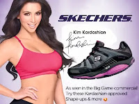
From the Kim Kardashian Skechers advert, I can see some of the stereotypes in the 1950s and '60s adverts being reused. She not only has silky hair, but also makeup, similar to the previous adverts. In addition, she is wearing revealing, 'vulgar' clothing, catering to the 'male gaze' once again and reinforcing the idea that women exist for the pleasure of men. Most importantly, she has a 'modelesque' figure, perhaps unintentionally suggesting that women must always be 'skinny', once again, for the sake of men.
 
The Levi's Jeans advert subverts some old stereotypes, while also reinforcing others. For example, the women in the advert are not wearing dresses, suggesting some progression in that women were restricted to the expectations of wearing more 'lavish', 'lady-like' outfits. However, the advert unfortunately utilises the stereotypes that women must always be pretty (again, wearing makeup and having perfect hair), they must cater to men's sexual whims (by wearing revealing clothing), etc. 

The Dove advert is by far the most progressive, it intentionally refuses to use the stereotype that women must always be in 'model' shape by using an older woman who isn't as skinny as most models are (for lack of better phrasing). Furthermore, while her clothing 'could' be considered revealing to some audiences, it is not used to represent her sexually and instead emphasises a sense of having pride for your body, no matter what it looks like. The advert instead creates a 'non-stereotype' in a way, in that it illustrates that women can be who they want to be without any restriction.

5) How do your chosen adverts suggest representations of gender have changed over the last 60 years? 
 
Representations of gender have changed heavily as harmful, misogynistic stereotypes of women continue to be abandoned: women are no longer subjected to unrealistic beauty standards ("lookism"); women are no longer expected to be mothers and housewifes; women are no longer used in advertising to target a heterosexual male demographic; women are no longer depicted as dependent on men; etc. Instead, advertising usually celebrates diversity in all areas, with women being portrayed as more independent and confident. While the post-2000s adverts do show some outdated stereotypes being reinforced, in the present, a company would receive substantial backlash from consumers. This has inspired a significant shift in marketing, with many adverts using men where adverts from the '50s and '60s would usually use women (for example, in cleaning adverts, cooking adverts, etc.) However, companies can and will sometimes 'slip up' and create an advert that unintentionally propagates dated ideals, and with the general attitude of the public shifting from being passive to more outspoken, these representations would now, fortunately, be considered wrong.

Extension tasks

Find three adverts that subvert gender stereotypes, post the images/links to your blog and write a paragraph about how they subvert the way women or men are usually represented in the media.
 
 
   https://creativereview.imgix.net/content/uploads/2022/03/KV_Double_CityInsitu-scaled.jpg?auto=compress,format&q=60&w=1620&h=1080 

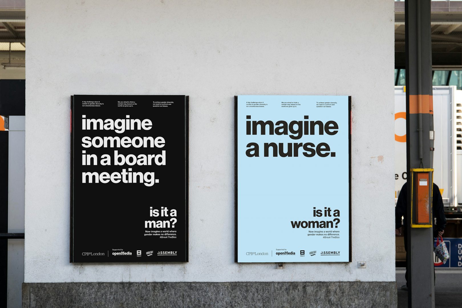
The Nerf advert subverts the way that girls are usually represented in the media, as they are usually, in toy adverts, playing with dolls or more 'girly' toys. Instead, she is playing with a toy gun, suggesting a progression in that children are no longer restricted to gendered toys. The advert in the middle calls out the general public for thinking too 'stereotypically' in a way, in that we associate certain professions with different genders. It makes consumers uncomfortable with their own way of thinking, with the advert practically telling them to 'do better'. The Dove advert subverts the outdated stereotype that only women take care of children, while men are the 'breadwinners' and neglect to spend time with their children. It does this by having a father hold the baby instead, showing a trend where men in advertising are depicted in places where women are stereotypically expected to be.

Read this Guardian article on seven female stereotypes that were identified in Australian adverts. Do you recognise the stereotypes that the article discusses? 
 
The article states the seven stereotypes as:
  • Model mother – depicting women as the sole caretaker of the home and children.
  • Passive little girl – ads showing young girls playing with dolls and home appliances.
  • Observed woman – women losing their voice to a male narrator and often intersects with the sexualised woman stereotype.
  • Sexualised woman – the seductive woman that suggests only value is their sexual appeal.
  • Pretty face – ads that only include women for aesthetic purposes.
  • Magical grandmother – older women, often in the kitchen, as a supporting character who is there to offer love to younger characters.
  • Ticked-box character – women from diverse backgrounds being included but without any substance, lines or backstory.
The "model mother", "passive little girl", "sexualised woman", "pretty face" stereotypes (although found from modern adverts) were typically used in adverts from the '50s and '60s, where these more outspoken and 'candid' stereotypes were unlikely to receive any backlash. The other three ("observed woman", "magical grandmother", "ticked-box character") have emerged more recently, with these stereotypes being less noticeable in comparison to the others.

This Guardian article reports the first adverts banned for using negative gender stereotypes. Do you think the ASA was right to ban them? 
 
While I agree with the general notion that adverts using negative gender stereotypes should be banned, I do feel like this rule would be quite difficult for anyone, not just the ASA, to enforce, because there is no objective, universal limit to the word 'stereotype'. Potentially, anything could be a stereotype, but how could you tell when it becomes harmful? It's impossible - everyone would have a unique interpretation and reaction if we all witnessed the same advert, some may be hurt by it and some might be inspired by it. Of course, banning more overt negative representations would be easier, such as adverts similar to those found in the '50s and '60s. But, when it comes to most other adverts, where stereotypes can be used very subtly - either intentionally or unintentionally, where do you draw the line? Therefore, I do not agree with the ASA, as there is no foundation that they can use to justify banning any advert.

Thursday, 9 January 2025

Advertising: Key Conventions


Part 1: Skittles Advert Analysis

1) What key conventions of print adverts can you find and what are the connotations or deeper meanings of each convention? For each convention, write about how it communicates meaning to the audience. See the Maltesers advert above for an example of how to do this.

A Product Image (both the packaging and the rainbow) to make it easy for consumers to spot the product in stores or online. Through the use of a rainbow and a rainbow colour scheme, this image reinforces the playful and fun brand identity of Skittles. 

The Logo is large and in the centre of the advert - it is the first thing people see. Although the word 'Skittles' itself comes from a sport, it has come to be associated with the brand instead.

The Background is a vibrant, blue sky. It is eye-catching and has connotations of childhood innocence, helping the advertisement cater to its target audience (children). For adults, it may make them think that buying Skittles will give them the same sense of enjoyment they had when they were a child.

The Slogan, 'Taste the Rainbow' creates the idea that Skittles contain a multitude of different flavours that will cater to many different people, meaning that they can be enjoyed by anyone.

The Colour Scheme is rainbow, which is heavily associated with Skittles, aiding in creating a brand identity.

2) What is the USP (unique selling point) for Skittles and how do you know? Does the advert use any of persuasive techniques listed above?
 
The USP for Skittles is most likely its 'Taste the Rainbow' slogan, as it tells consumers that Skittles has a wide variety of different flavours, making it special / superior in comparison to other competitors. Over time, the slogan has come to be associated with Skittles, helping to create a playful and fun brand identity (derived from the connotations of the word 'rainbow).

The advert uses imperative language in 'Taste the Rainbow' to make consumers feel as though they need to try the product. Furthermore, through the use of repetition, Skittles has also created an established brand identity, that is somewhat more whimsical and associated with a sense of childhood innocence.

Part 2: Advert Research


Use Google images to research classic adverts. Find examples for the following and add them to your blog:

1) An advert with a clear brand identity

ads use golden arches for wayfinding 

2) An advert that uses shock tactics or a controversial idea


3) An advert that creates a a strong emotional connection to the audience

charity needs digital advertising ...


Bonus: Can you find an advert that shows women or men in a way they don't normally appear (this is an example of representation in media - subverting the typical representation of gender. We will be studying this next week!)

This artist has reversed the gender roles of old-school adverts to show how  sexist they are

*This is actually a recreation of an old, misogynistic advert, that instead said 'Show her it's a man's world', and alternatively had a man in the bed.


Extension Tasks

If you have completed an in-depth analysis the Skittles advert and some research into classic adverts, do some additional research into creative or powerful print advertising

Task: Find an example of a print advert for EACH of the following:

1) An innovative or ‘different’, subversive concept (e.g the porcupine advertising VW car)

Clever and Inventive Print Ads ...


2) A foreign advert that you can understand despite the language barrier

10 Foreign Print Ads ideas | print ads, vintage advertisements, advertising  poster

Finally, read this excellent Forbes article on seven of the most effective adverts of all time. Which do you think is the best and why?

I think that the best (as in the most effective) advertisement is Red Bull's 'Red Bull Gives You Wings' campaign as it carries a variety of positive connotations, such as: Red Bull helps you concentrate; Red Bull gives you significantly more energy; Red Bull makes you feel better emotionally; etc. In doing so, it caters to a wide range of audiences and their needs, and convinces people who haven't tried the drink before to try it. Nike's 'Find Your Greatness' campaign is also effective in a similar way, in that it is inclusive and inspires many people positively.

Music Videos: Arctic Monkeys - I Bet You Look Good on the Dance Floor CSP

Audience: 1) What do we know about the Arctic Monkeys audience? Think demographics, psychographics and how they got into the band. Arctic Mo...

Popular Posts